All your videos should be premieres but don’t worry, I’m not expecting you to roll out the red carpet, today we are looking at the premiere function in YouTube, why you should be using it and how to set it up.
Read MoreHow To Create YouTube Channel Art In Canva
Channel Art Size Template
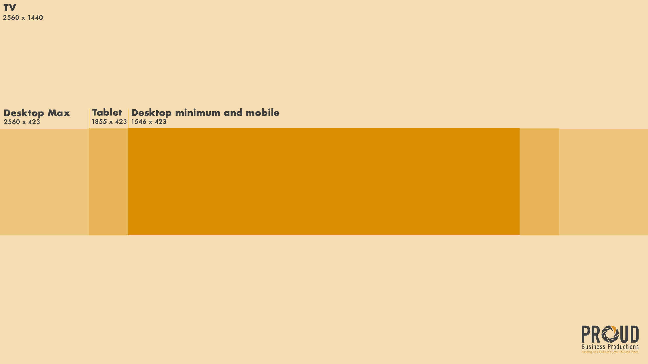
Before we start you are going to need a channel art size template as channel art is displayed in different aspect ratios across different platforms. As you can see in the image below, your channel art will be larger on a TV and smaller on a phone so you want to include all your vital information in the centre box. You can download my template for free by clicking here.
Create An Account And Select A Template
So to start you need a Canva account, don’t worry it’s free, just enter your name, email address and password.
So you’ve signed up and now you are on the homepage. In the search bar up the top, you need to type in ‘YouTube Channel Art’. This will bring up a list of results, we will be clicking the first one which is a blank template with the correct aspect ratio but if you want a bit of inspiration you can scroll down to see Canva’s different templates.
Select ‘Create a blank’
Upload Your Elements
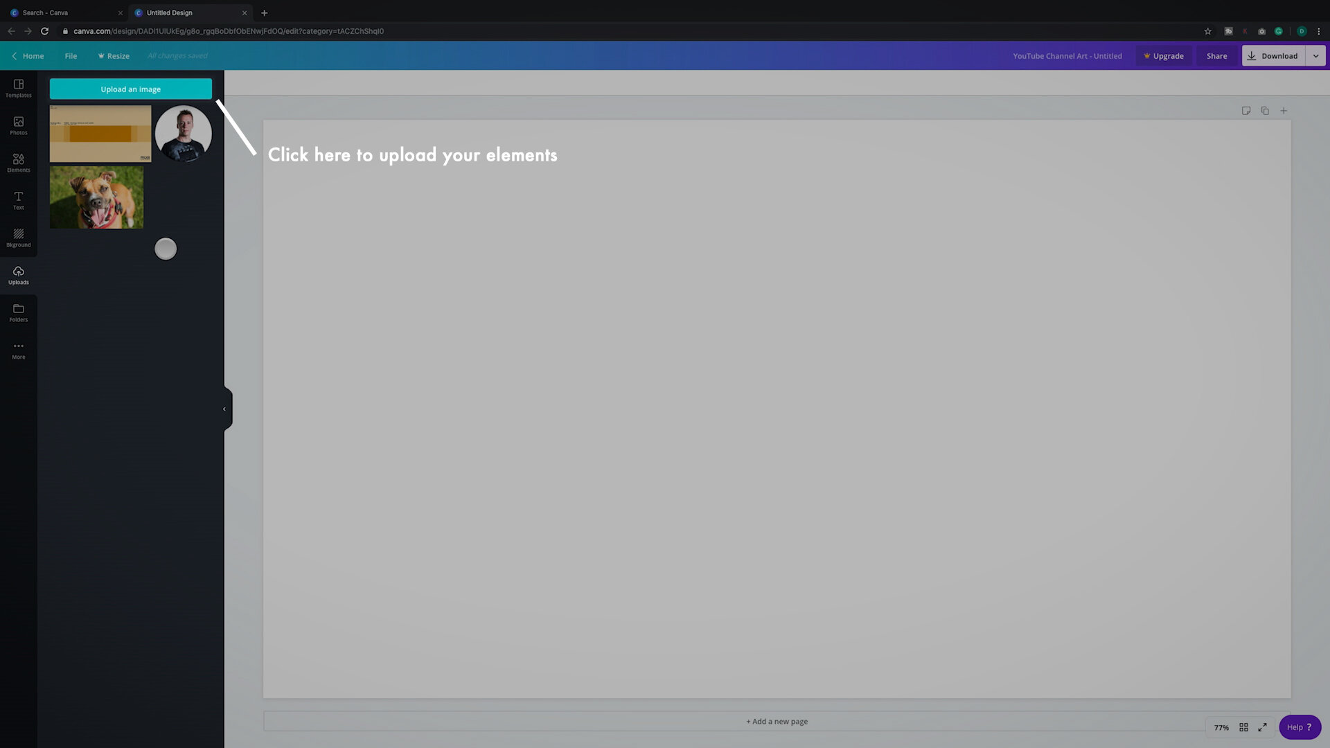
After clicking ‘Create a blank’ in the top left you will be taken to the editor. First of all, we want to collate all of the assets we are going to be using. On the left-hand side select Upload and find the files on your computer that you are going to use. Whilst you are here you can add any logos or elements that you are going to add.
Upload your elements
Setup Your Size Template
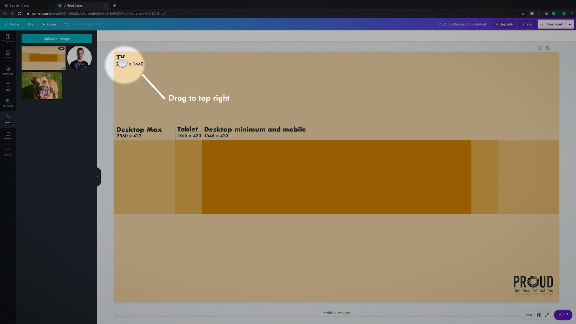
I am going to be setting this fake channel up as a dog training channel. To start you want to make sure that all of your elements fall in the safe zone. Do this by clicking and dragging my Channel Art Size Template to the top left-hand side, this will make it fill the screen.
Click and drag the size template to the top left corner.
Add A Photo
Now you want to start layering in your elements. Let’s start with your photo. You can add your company logo here but the statistics show that people connect more with a friendly face. Click on the image you want to add and the scale (by clicking and dragging the corners) and position (by clicking the centre and dragging) the image to where you want it, remember you need to keep it inside the smallest box in the centre.
Keep the image inside the box in the centre.
Add Content Types
Next let’s add some text. Click the text box on the left hand side and click ‘Add a heading’. This will create a text box on your image. We will use this text to tell people what types of content to expect. I will add training tips, games and enrichment. Click away from the text, you can then reposition the text to where you want it. I am going to move it to the right hand side, change the alignment to the left by clicking the alignment button up the top and change the font to match your companies branding. We can look at changing the font colour later.
Change the font
Tell Them When New Videos Are Released
Next, I am going to add a subheading , this will be used to tell people when to expect new videos. I think people are going to be more likely to watch dog training videos on the weekend so I will write ‘New videos every Saturday 10 am’. I will position this in the bottom centre.
Click ‘Add a subheading’ to tell people when to expect new videos.
Replace The Background Image
Finally, in the top centre, you can add your accolades, this could be any certifications you hold, any publications you’ve been featured in etc.
We are getting near the end now. Next, take your background image and drag it to the top left corner. This will make it your background image and scale it to the right size. As this is a dog training channel I am going to use this image of my dog Cleo and her stupid but adorable face.
Drag your background image to the top left corner.
Adjust The Background Image
You will now be able to see if your text is visible enough. If your text is not clear there are a few ways to correct this. The first is to modify the background image. Do this by clicking the image and selecting ‘Adjust’ at the top. Now you can add blur and bring down the brightness to make your text stand out. As I like this photo of Cleo I don’t want to do this.
Adjust blur and brightness settings to make text more readable
Change The Text Colour
The next step you can try is changing the colour of the text. Do this by selecting the text anding clicking the colour panel up the top. Try switching to white or black, this hasn’t made a difference for me so I am going to move on to the final step. You can also try changing the colour of the text to your branded colours by clicking the + icon and typing in your HEX code.
Change font colour
Add Colour Blocks
The last way to make your text stand out is by adding colour blocks behind your text. Click elements on the right-hand side and select the square. Re-size and position the block over your text, click the ‘Position’ button in the top right and select ‘Send Backward’ to move the block behind the text. If you click the colour box on the left-hand side you can also select the colour of the box, you can even click the + button to enter the HEX code of your companies branded colour.
Re-size and position your block over the text
Move the colour block behind the text.
Change the shape block colour
Download Your Channel Art
Repeat this for all of the text and you are done. All that is left to do is click download in the top right-hand corner. Navigate to your YouTube channel and upload your new art and you are done.
Download your final image and upload it to your YouTube channel.
That’s A Wrap
So now you have shiny new YouTube channel art that tells your viewers who you are, what content you produce, when to expect new videos and why they should listen to you. Have you seen examples of great YouTube channel art? Leave links in the comments below.
